Antioch Aviation
brand design
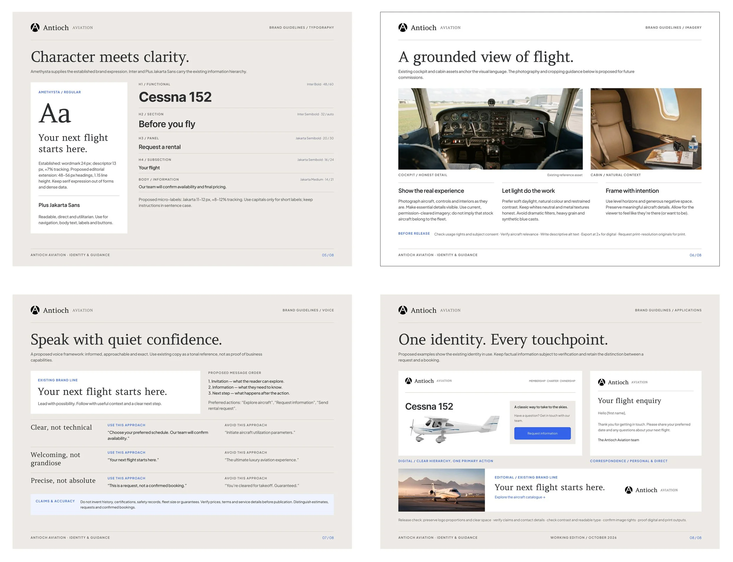
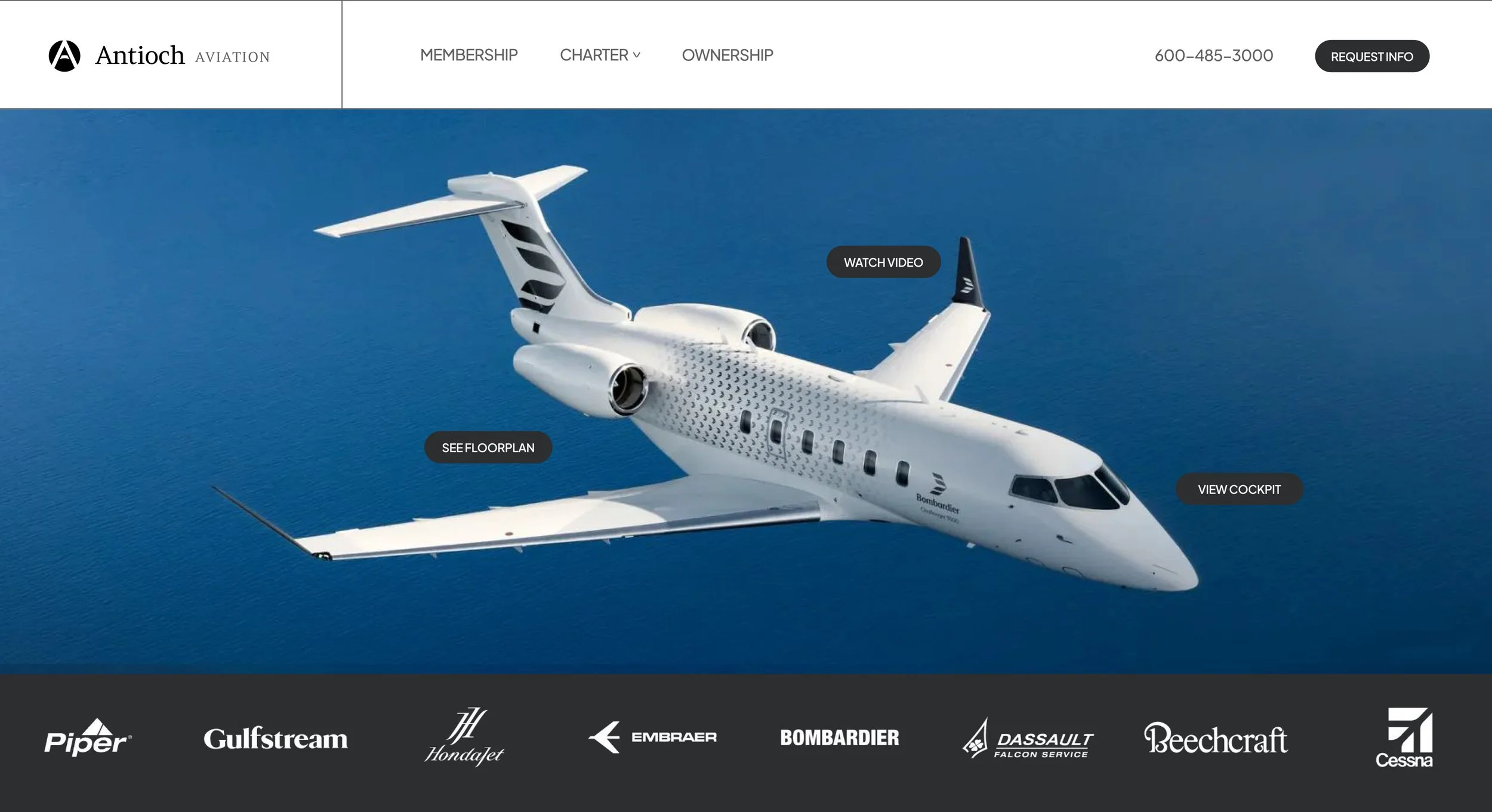
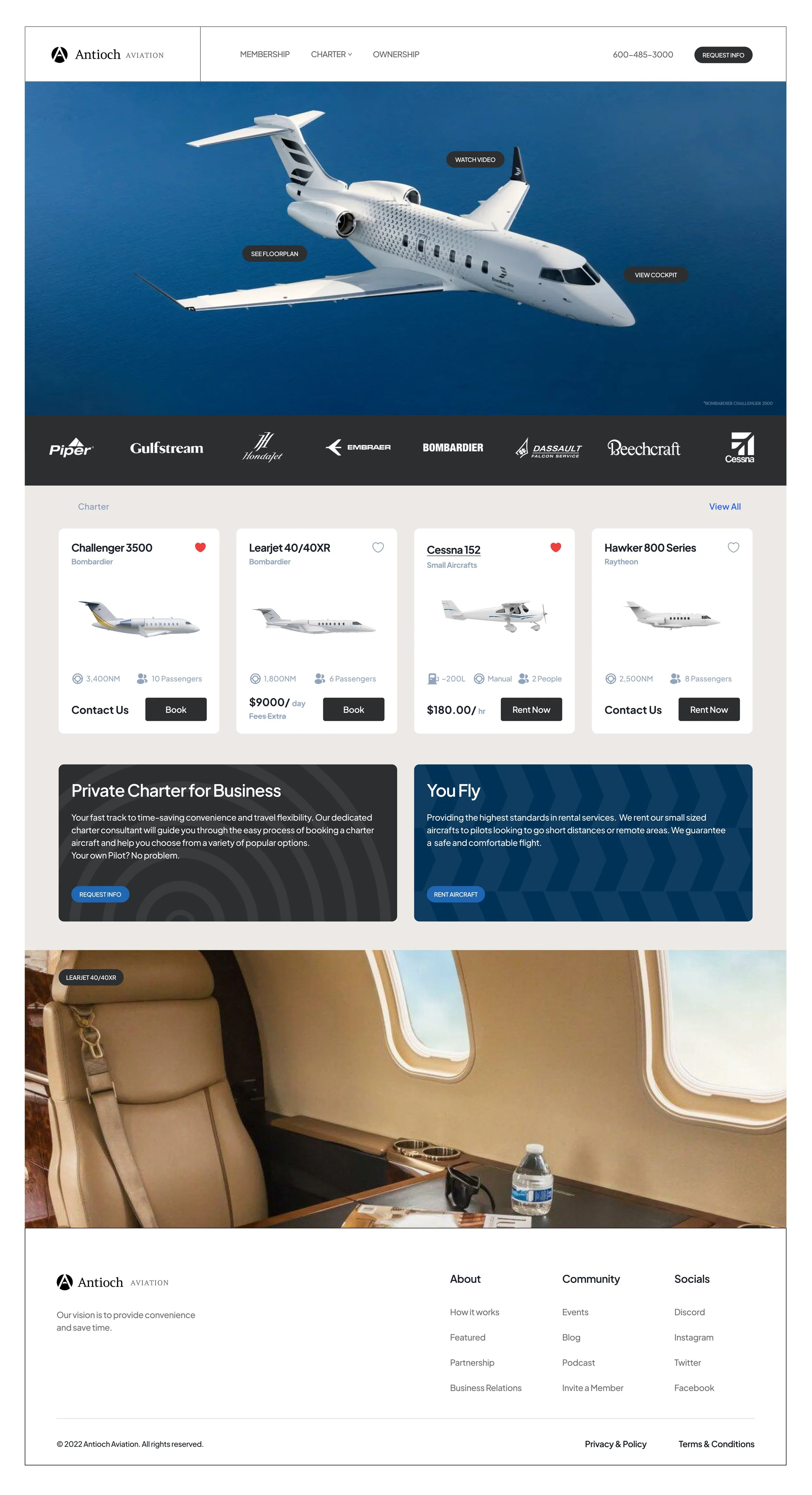
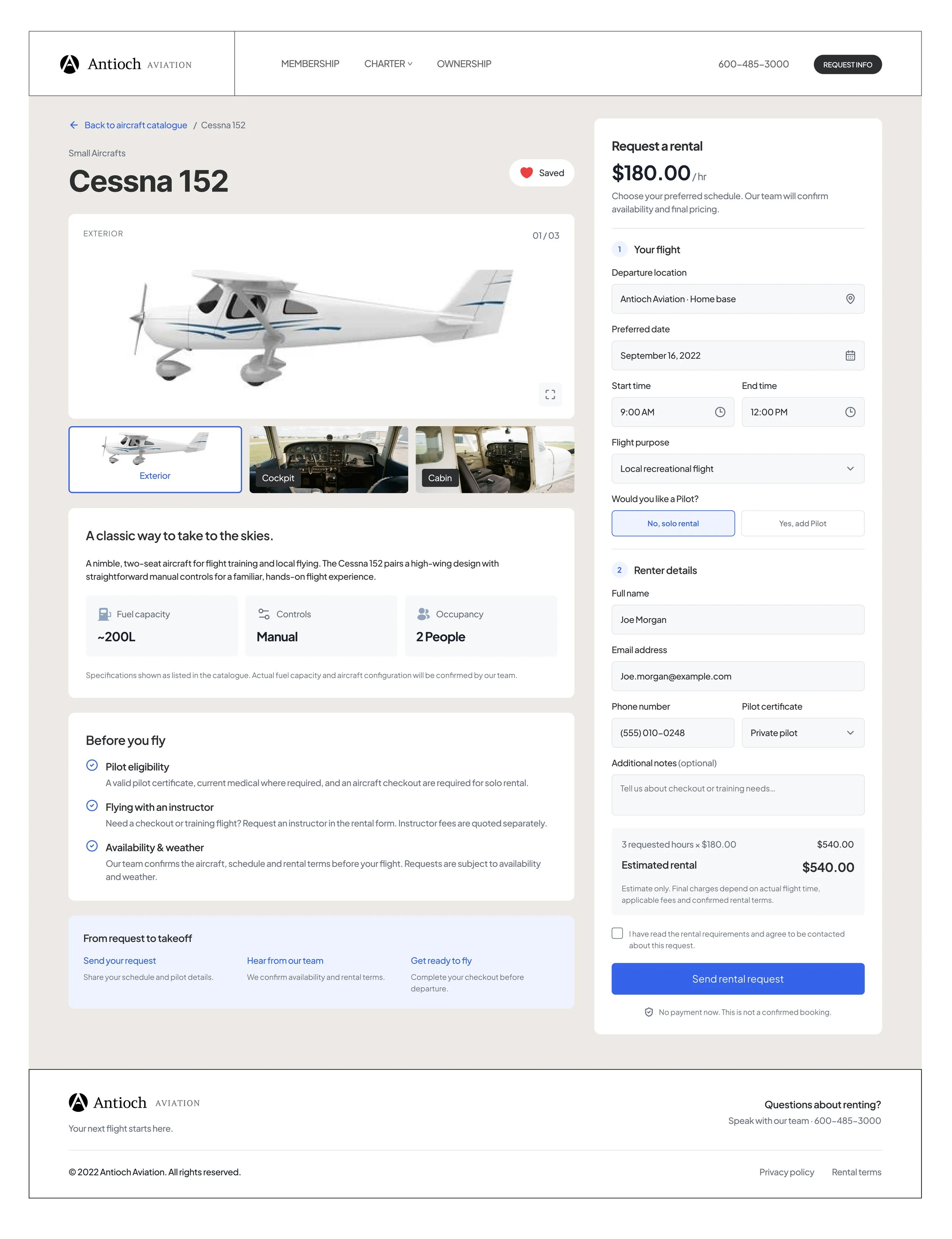
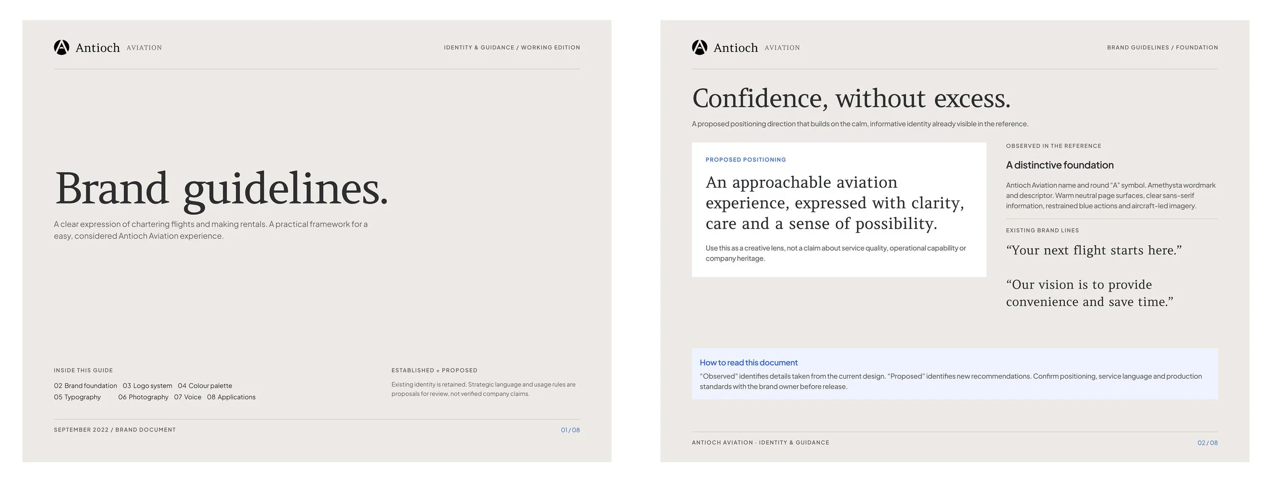
In 2022, I developed the corporate branding for Antioch Aviation, creating a cohesive visual identity that reflects the company’s vision and position within the private flight industry. The project focused on establishing a distinctive brand presence through a consistent visual language, focused on establishing a sense of “accessibility and approachability” into flying private.
Logo & Wordmark
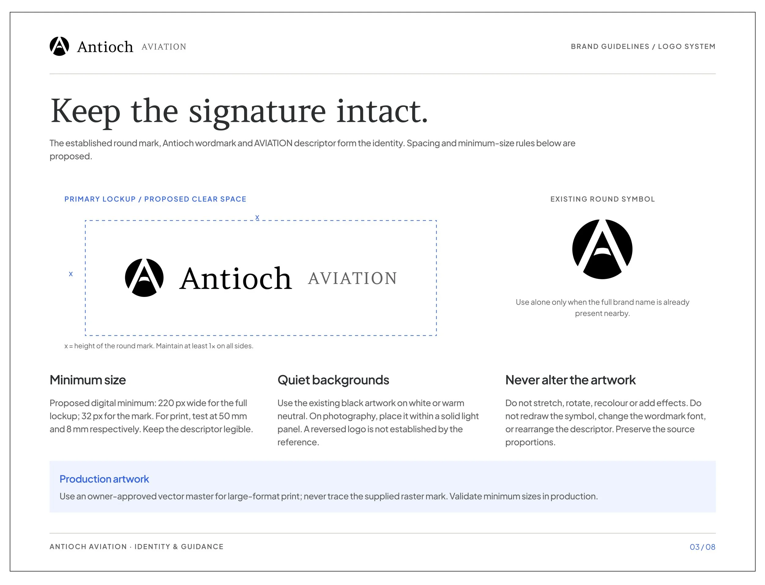
The Antioch Aviation logo system pairs the company’s existing circular emblem with a refined serif wordmark and understated “AVIATION” descriptor. The identity guidelines define clear-space requirements, minimum sizing, background usage, and rules for preserving the original artwork. The result is a more consistent and professional brand presentation across digital, print, and corporate applications while maintaining the recognition of the established logo.
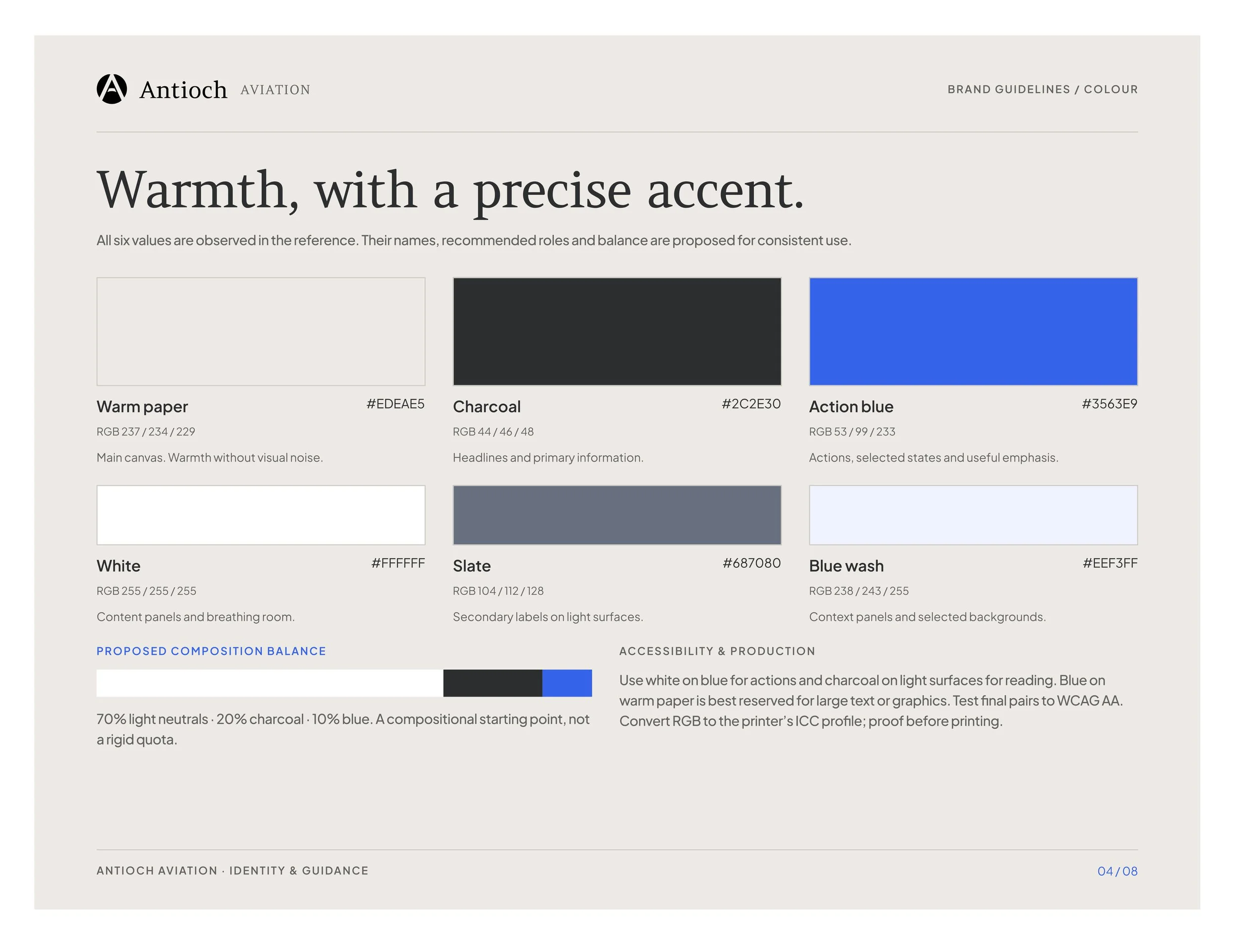
Brand Colours
Warm paper and white create an open, welcoming foundation. What can everyone relate to when flying? The big blue sky. Atmosphere. The vivid action blue introduces that energy and clarity across key interactions. Together, these colours create a clean, contemporary identity that feels trustworthy and accessible without sacrificing technical and professional precision.